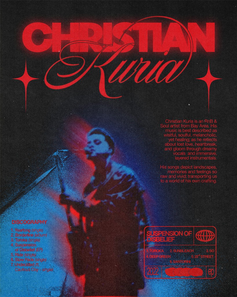
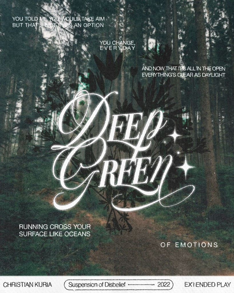
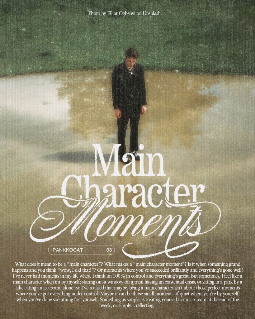
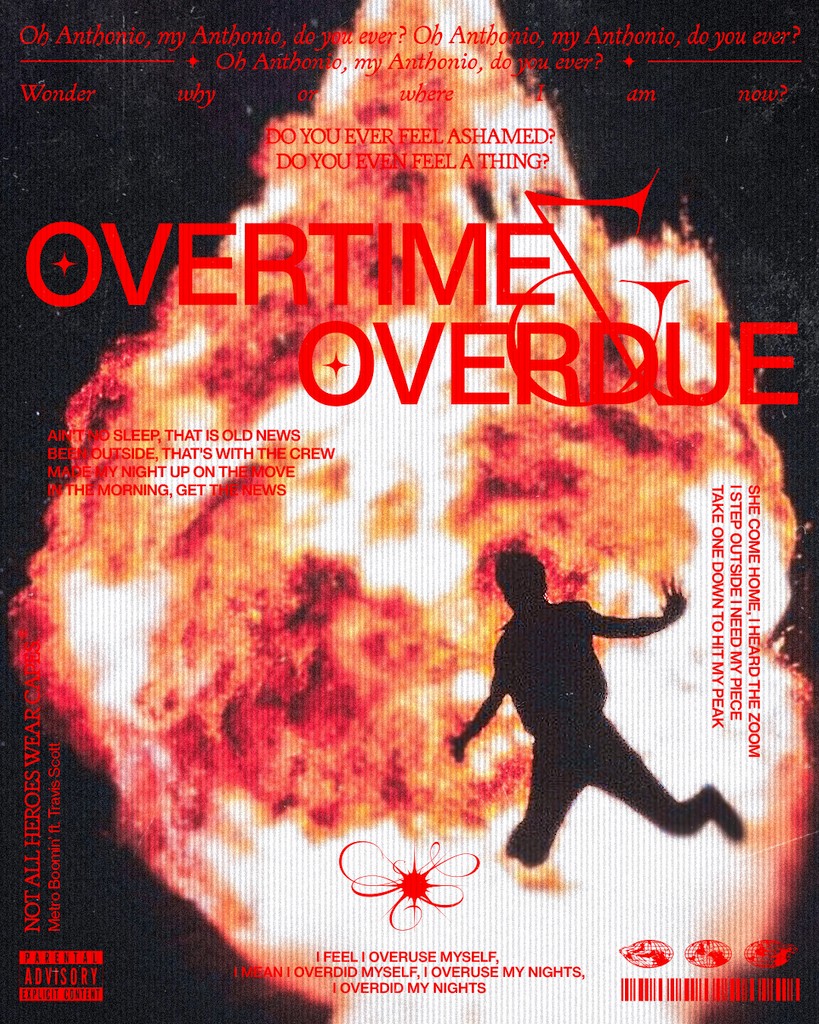
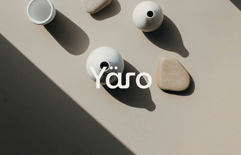
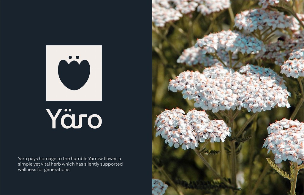
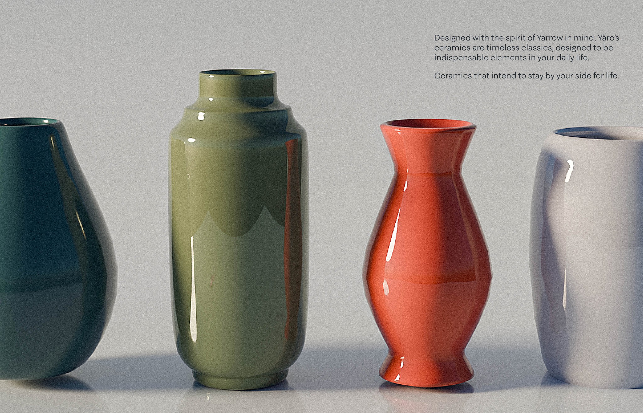
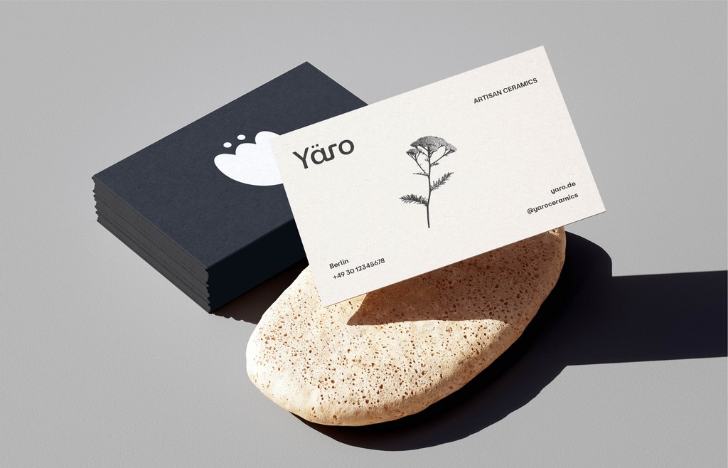
Yaro
PERSONAL PROJECT
ONGOING

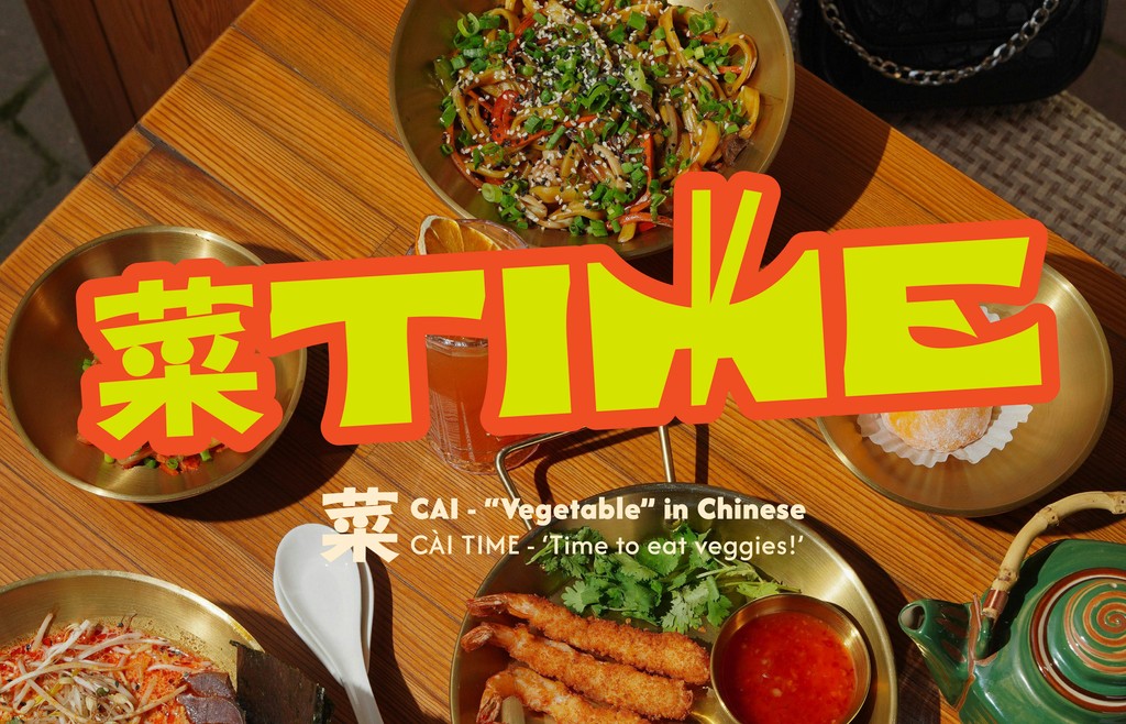
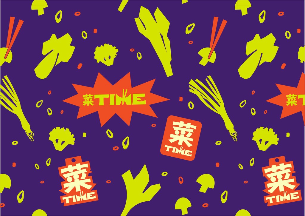
CàiTime
PERSONAL PROJECT
ONGOING
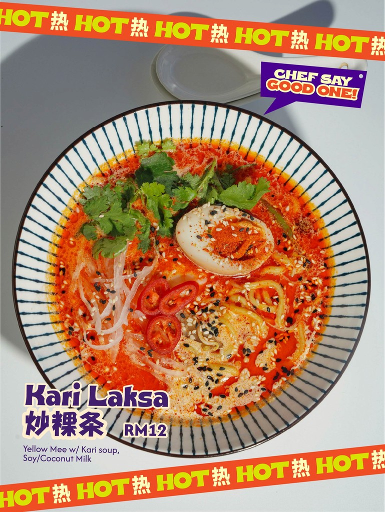
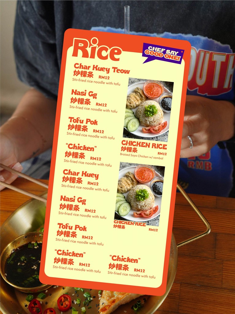
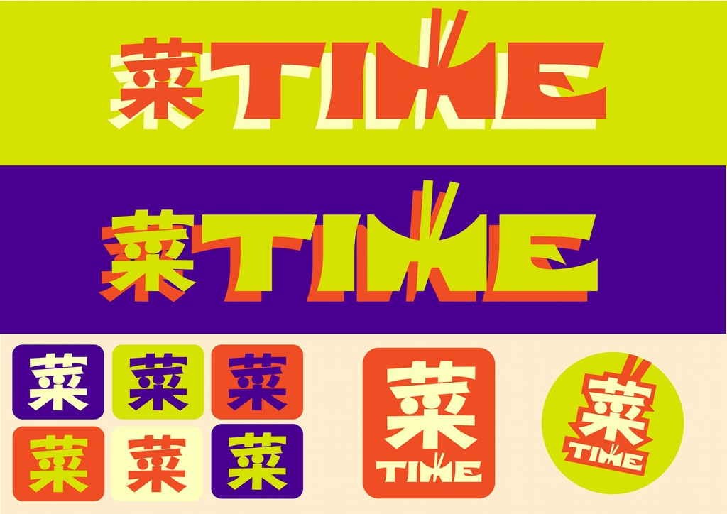
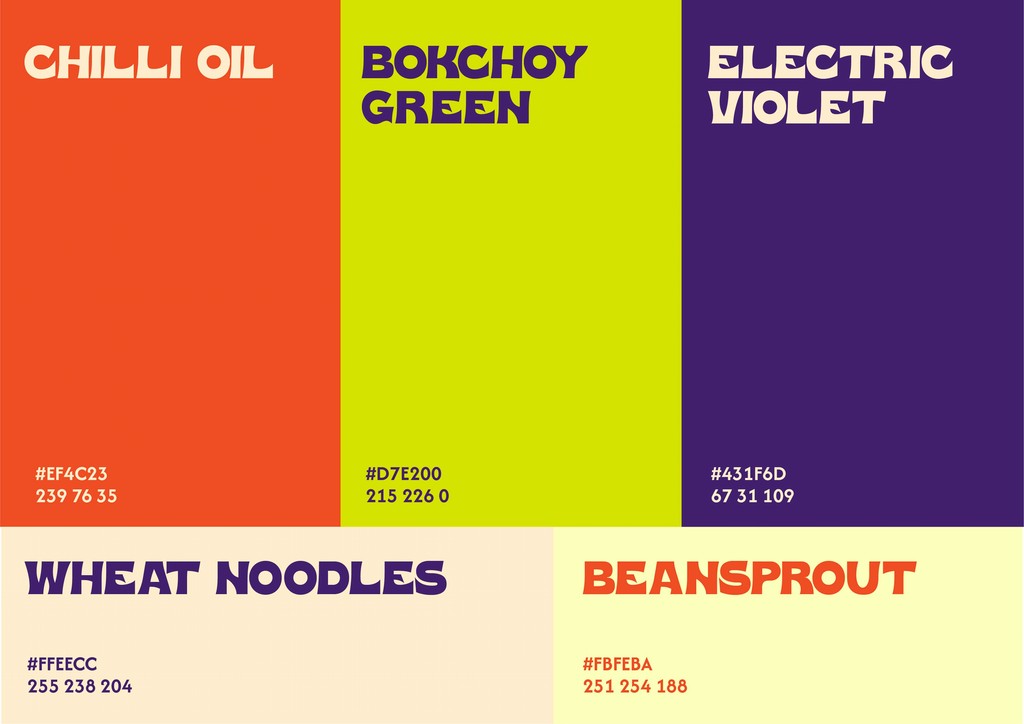
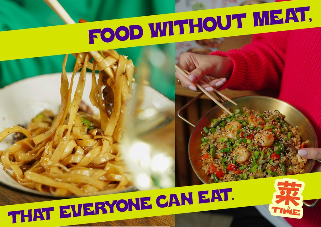
菜TIME (Cài Time) reimagines Chinese Vegetarian cuisine for Gen-Z Malaysians. Growing up vegetarian, I noticed how being vegetarian wasn't common among people my age; and how it was treated as niche; linked mainly to religion, spirituality, or health-conscious lifestyles.
This project aims to challenge those stereotypes by making vegetarian food feel casual, fun, and inclusive; something anyone can enjoy every day.
Using bold visuals and a playful tone blending Mandarin and English slang, the brand aims to normalise vegetarian food; showing that it’s not just for a specific group, but for everyone.

Too Good for Snow
COMMISSION
CLIENT: Liam Kelleher
Too Good for Snow is an ad campaign aimed at repositioning Oakley’s signature goggles as fashion-forward accessories—not just technical gear. I was commissioned to design a series of adverts using the client's photographs, showcasing the goggles as timeless statement pieces that can be worn far beyond the slopes. Inspired by the layout and confidence of vintage ads, the visuals were crafted to elevate the goggles as icons of both performance and style.


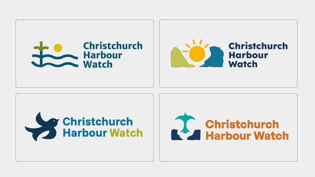
LIVE BRIEF | REBRANDING
CLIENT: Christchurch Harbour Watch
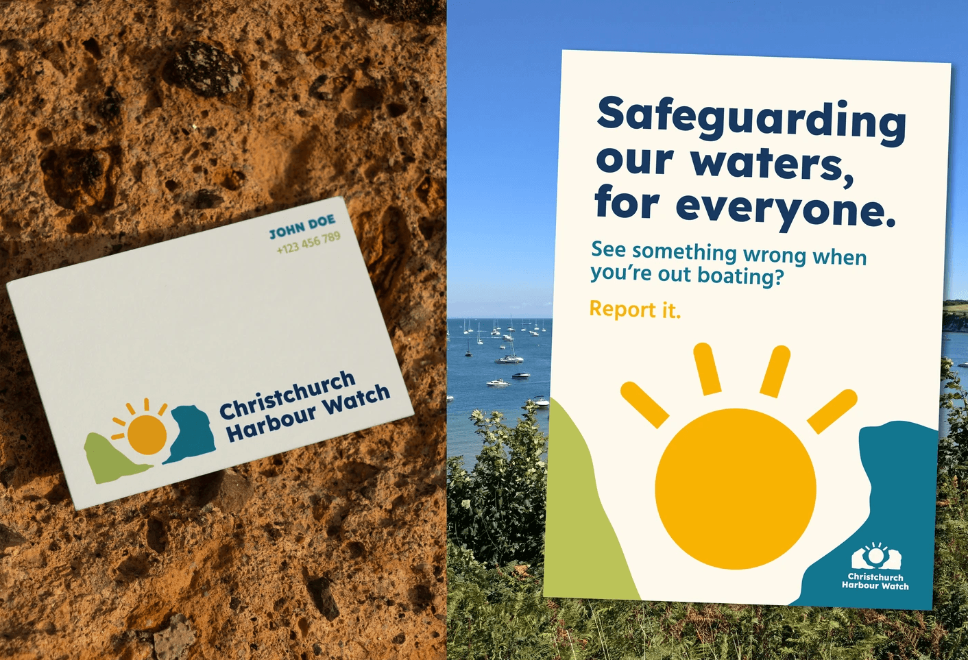
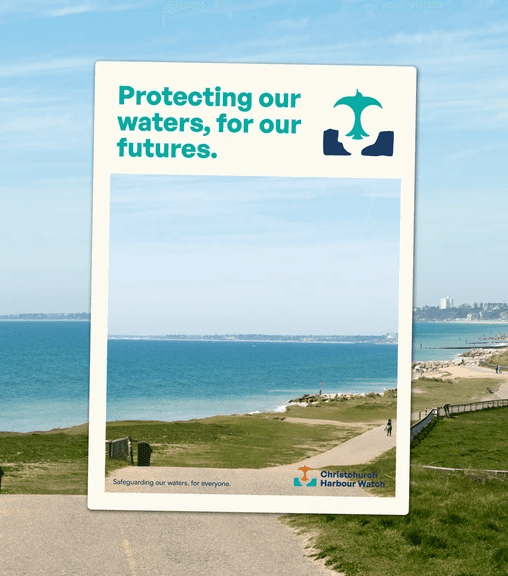
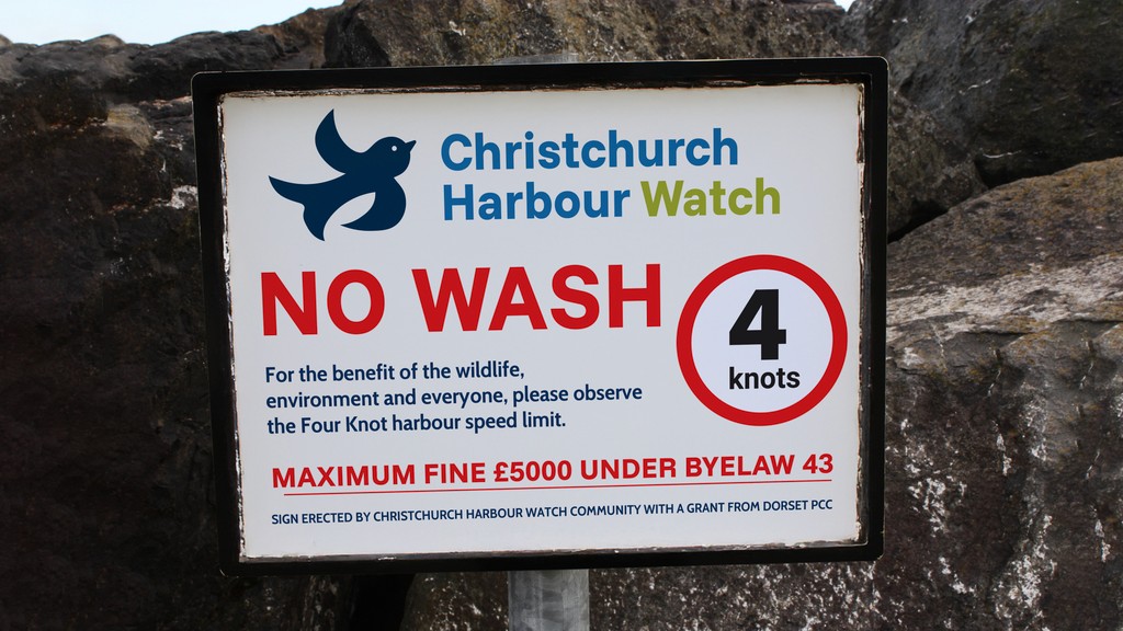
Drawing inspiration from the harbour’s geography, especially The Run, and Christchurch’s reputation for birdwatching, I developed logos that symbolically tie to the place while standing out visually. The designs balance boldness and friendliness by using bright, welcoming colours, chosen to resonate with a wide audience, including younger generations.
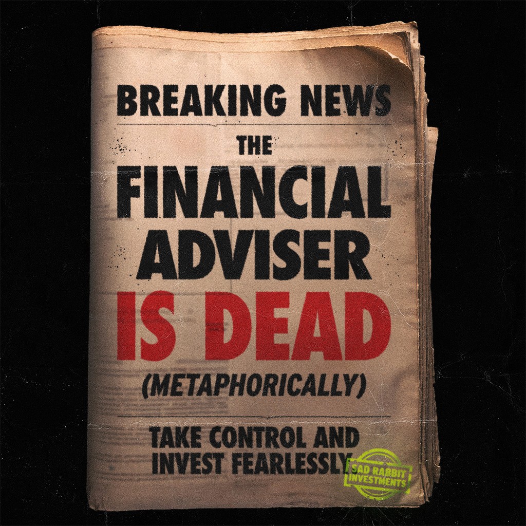
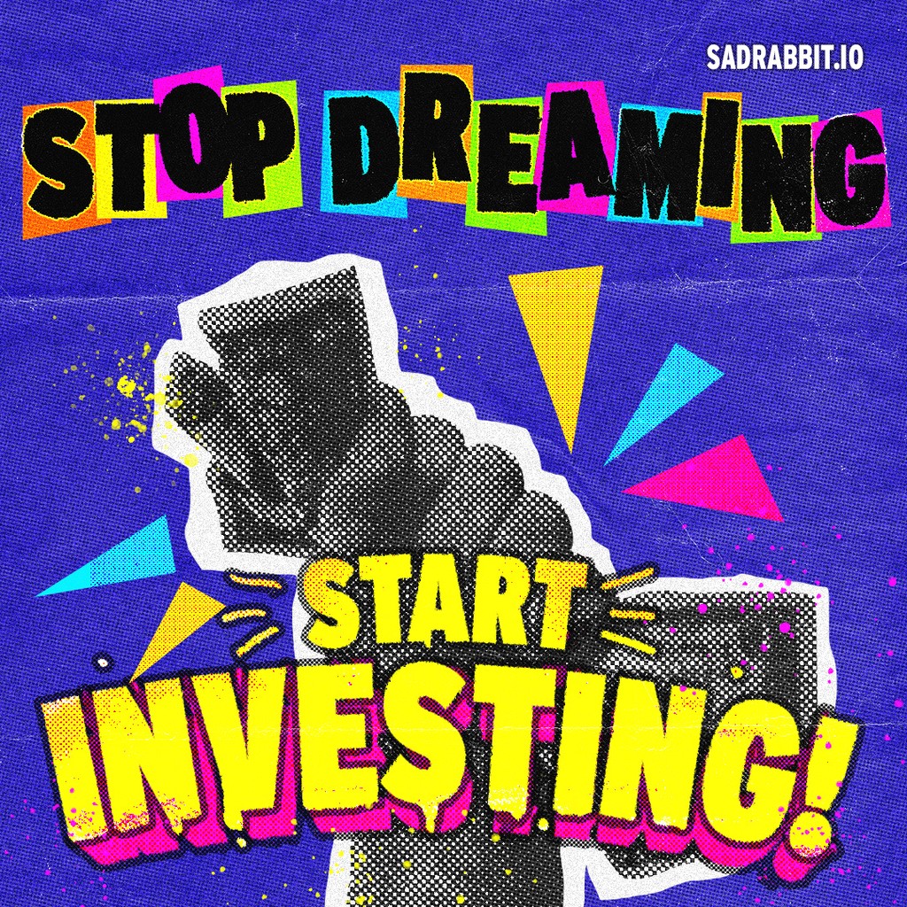
Sad Rabbit Investments
SOCIAL MEDIA POSTS
CLIENT: Sad Rabbit Investments | Worksity
Tasked with making investing more appealing to Gen-Z, I designed a series of bold, punk-rock social media adverts. The goal was to break away from traditional, serious financial visuals and create something fresh, edgy, and relatable to a younger audience. This was my first time designing in this style, so it was a really fun challenge!